For this final lab, I chose to
analyze the environmental and population effects of the 2009 Station Fire.
There was a wide range of complications, issues and disastrous effects of this
fire due to its location and the topography of the area. My title map shows the
extent of the fire over a period of five days, reaching its max extent on September
2nd, 2009, covering 160,557 acres of national forest land. The map
also displays the Angeles National Forest in relation to Los Angeles County and
the perimeter of the fire over the five days.
My theme map covers multiple impact
areas of the 2009 station fire. The first I would like to discuss is the
Altadena Foothills and Arroyos Significant Ecological Area. This area possesses
diverse biotic resources that are valuable to preserve and maintain as a part
of the Los Angeles County’s general plan (1). As you can see, the fire extended
into this area, consuming almost 50% of its mass. In addition to this, the
rivers and creeks of the area also carried debris and pollution into the
surrounding areas causing damage to its ecosystem (this will be discussed
further in the next map, including DEM data).
In addition to destroying hundreds
of thousands of acres of land, the fire also claimed 89 residences. The housing
unit population can be seen at the southwest corner of the fire extent. It
managed to cover one of the more densely populated areas before firefighters were
able to control the flames (2).
One location that was put in
jeopardy is an extremely valuable site to UCLA. The Mount Wilson Observatory,
owned by UCLA, is a 150-foot solar tower that takes daily magnetic field
measurements of the sun’s surface. The fire reached dangerously close to this
location, but due to good weather conditions and firefighter’s efforts, this
extremely important and expensive landmark was saved (3).
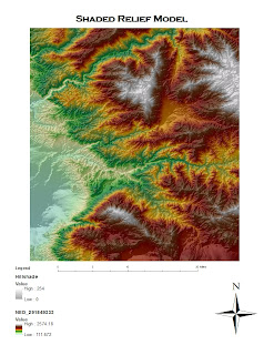
- The firefighters faced many issues when attempting to contain the fire and preserve the locations discussed above. One of the major obstacles they faced was the topography of this area. “Due to the steepness of the topography, this
area is very susceptible to extreme fire behavior. The steep slopes and deep drainages promote significant preheating of fuels which can lead to rapid upslope
and upvalley fire spread” (4). The steepness of these slopes range from 33 to
67 percent (5). This map also displays the rivers that carried debris
throughout the park. The heat, fire retardant and debris killed many of the
fish in this ecosystem as well. Research is still being conducted on the range
of damage the fire did to the river's fish and other lifesystems.
This 3D map of the range covered by the fire depicts the steep terrain firefighters had to deal with. The sediment debris from the slopes into the channels below increases risk for wildfires (6). This terrain was coupled with the extremely dry conditions, "less than 30% of normal"rainfall.
Resources:
1) Franchino, Nick. "Los Angeles County GIS Portal." June 6, 2011.
<http://egis3.lacounty.gov/dataportal/index.php/2011/12/12/significant-ecological-areas-sea-proposed/
Wilson Observatory>
2) Thompson, Richard, et al. "The Station Fire: An Example of Large Wildfire in the Absence of Significant Winds." <http://www.wrh.noaa.gov/wrh/talite1002-1.pdf>
3) Steinberg, Harriet. "2009 Los Angeles Wildfires Concern Mount Wilson Observatory Astronomer." September 3, 2009. <http://voices.yahoo.com/2009-los-angeles-wildfires-concern-mount-wilson-observatory-4183349.html>
4) United States Department of Agriculture. "Fire and Aviation Management: Station Fire Initial Attack Review." November 13, 2009. < http://www.fs.fed.us/fire/station_fire_report.pdf>
5) Randal, Archibold. "After a Devastating Fire, an Intense Study of Its Effects."THe New York Times. October 2, 2009. <http://www.nytimes.com/2009/10/03/science/earth/03fire.html?pagewanted=all>
6) Lamb, Michael, et. al. "A Model for Fire-Induced Sediment Yield by Dry Ravel in Steep Landscapes." Journal of Geophysical Research. September 8, 2009. <http://smtp.joelscheingross.com/papers/Lamb_et_al_2011_JGR_ES.pdf>


